We want to say Happy Site Launch to Doc Green’s! Wichita natives know that Doc Green’s is a popular healthy eating destination, growing from one store in 2005 to their third opening this year in the College Hill neighborhood. We started working with Doc Green’s almost a year ago to revitalize and rebrand the stores to prep for their new location.
After launching their new in-store branding, Doc Green’s wanted to revitalize their digital marketing to match, including their website. They also needed a site that was easy for them to update in-house and allowed them to showcase their gorgeous professional food photography.
So What Was The Problem?
Doc Green’s old website wasn’t necessarily ineffective, but it didn’t reflect their unique business or match the new branding we had created. They also wanted to work with a local company (who frequents their business and LOVES their salads) so they’d understand better how they fit into the Wichita market.
Doc Green’s also wanted to highlight their online ordering and make it an easier user experience, bring more attention to their catering services, and provide stunning visuals to match the ownership’s vision for their business.
How We Helped Doc Green’s
Design
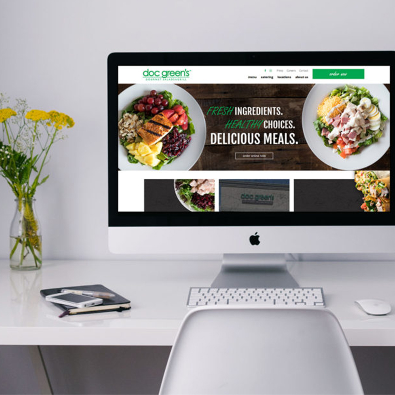
Design was definitely the number one concern for Doc Green’s and owner Tammi Kuthan. She loves gorgeous visuals and clean aesthetics and wanted the site to feel like you had just walked into one of their three restaurants. If you take a look at their site, go visit the location nearest you (or check out our portfolio for some images) and you’ll see how the styles blend together.
Site Organization
One of the things that Doc Green’s wanted was to make their site easier to navigate. This included adding an Online Ordering page that made it easy to order for Pick Up or Delivery from the same place (something they didn’t have before). They also have three locations, each with their own Facebook, so we directed their Facebook icon to their Locations page, where they can find the specific Facebook page they are looking for.
The key addition for them, however, was adding an About page. A simple page, it allowed them the ability to communicate their values and unique offerings in a clear, concise way. As a family-owned business who puts great emphasis on their quality ingredients, they wanted a way to highlight those things without users having to figure it out from their menu.
Putting Power Back in Their Hands
While Doc Green’s menu doesn’t change a lot, they wanted to be able to update their pictures, pricing, and content throughout the site without spending a lot of money in maintenance. We built their site to be easy to update, with clear editable blocks, places to swap out imagery, and video training to help them continue to maintain their site.
Final Thoughts
We love working with Doc Green’s and are very excited for the next piece in their branding! One of our main goals as a marketing agency is to help our clients have consistent branding throughout their marketing materials, so no matter how a customer interacts with their business they know who they are working with without question. Now on to the next piece of their marketing puzzle!